Wednesday 25 December 2013

25 December 2013 Documentation

Its Merry Christmas today and I still struggling to producing my hypercomic. Its my semester study break, so it looks like I have more extra time to focus on my project.

First and foremost, I have create another main character of my story, the Ice Ninja.

As he is an Ice Ninja, I make him wearing some Eskimo suits to imply that he is very cold? Here are some of the example I have found about the suit:

In addition, I have also done the final refinement to my story flow chart and plan to start doing the storyboard in next few days. Here is how the new story flow chart look like:

I have scale down my story using Non-Linear narrative method which is characters' flash back memory to shorten my story. So this flow chart will be my guide line to produce my storyboard. Merry Christmas!

Sunday 22 December 2013

22 December 2013 Documentation

Charlie Chaplin says that “A day without laughter is a day wasted”. For me, a day without drawing new comic plot for my project is a day wasted.

I am not a misanthrope.

Just that I feel a bit tired and exhausted with my current life. Momentum seems to be leaking out of me every second. Going out for a walk to get some fresh air? Nah, I shall just sit at home. Searching for online resources? Oh well, why are things getting harder to understand recently? Sketch some new comic plot? Ok, but what should I draw? The brain is not cooperating. It disagrees to brainstorm for me.

There are no new ideas, no inspiration… 

Perhaps I should take a day off? But I had been sleeping for more than 10 hours…
What’s wrong with me? I shall stop looking for excuses to run away from my duty and responsibility                                                                             
I need a light-house 
A light source that can guide me;
directing me to my goals                                                                                              
and stop me from procrastinating.

One day is enough for such an unproductive day 
Hopefully things will get better by tomorrow 

PLEASE give me a reason to move on… 

Monday 16 December 2013

16 December 2013 Documentation

Well, today is the Work In Progress sharing session among the classmate. Although I have done enough of preparation, I still feeling a bit nervous as I am out of track if referring to my Gantt Chart schedule. I have prepare a Power Point slides as shown below:

After my presentation, I have received a lot of feedbacks from my peers and lecturers. First of all, my lecturers feels that my researches are too wide and some of them is even irrelevant to my project. It may seem awesome at the first glance but if I do not focus deeply into each of them, they are nothing but just a group of plain texts and images. Although the comments I get from my lecturers are a bit direct and hurt my feelings, after I considering their advises, I found out that what they mentioned are correct, I had totally lose my own directions because of tons of researches I have found and do not know to start learning from which tutorials. For example, instead of looking for so many "Chibi" tutorials, I should start finding a art style that suite me and start practice about the style. This feedback is definitely very important to me to avoid myself becoming Jack of all trades, master of none.

In addition, one of my lecturers also suggest me to stop looking for addition researches and start converging the researches I have found into something that can really benefits me. For example, how can "Chibi" art style link with ninja to create memorable characters? How can comic panel managements link with Adobe Muse to create interesting comic reading flow? All of this possibilities are what I should focus on instead of continue losing myself in searching for more and more tutorials. She advised me to stop researching and start filter, digest the information I have collected so far into something that can benefit my project.

Moreover, my lecturers also ask me to focus on 1 software and start to practice about it instead of putting myself in a dilemma about using which software to create my hypercomic. Usually having a backup plan is a good practice, but when it started to make me fall into dilemma, then is time for me to stop considering and dive into a software that I have selected. The factor that causing me in dilemma is that Adobe Muse do not have certain function provided by Adobe Flash, and thus I am worried that I am not able to finish my artefact on time. However, one of my lecturers convinced me to focus on my learning process, but not completing the artefacts as the mark given will be more on the learning process. They also suggest me to more practical by learning from practical classmates.

These are the feedbacks I have received from my sharing session. Although these feedbacks may be make me unpleasant, I am aware that they are correct guideline for me to be success in the future.

Sunday 15 December 2013

15 December 2013 Documentation

Tomorrow is the Work In Progress sharing session, have try my very best to prepare all the things I needed to do the sharing. Besides creating a character prototype, I also manage to find so useful tips on how to manage my comic panel wisely. Although I haven't think of how to draw my comic panels yet, these tutorials will come in handy in the following weeks.
This is a very complete tutorials and the essences of the dynamic panelling is keep things varied, according to the author of this tutorial.

There are much more tutorials I have found such as:
  • http://innerspace.notonigon.com/?p=8
  • http://www.mangatutorials.com/tut/paneling.php
  • http://wonderopolis.org/wonder/how-many-different-ways-can-you-read/
From all these tutorials, I can conclude that:
  1. There must be padding between panels to avoid audiences confused about the intercepting panels.
  2. Before drawing actual comic size panels, start by drawing panel thumbnails and arrange them properly as a guide to avoid waste of time and energy.
  3. Never have more that 8 panels in a page of comic to avoid information overloaded and crowded looking comic panels.
  4. Avoid using only simple shapes to draw the comic panels, sometimes irregular shapes can make the comic looked more interesting.
  5. Always remember that western readers read from left to right. This is kind of hard for me to adapt as I am from Asian Chinese background which usually read from right to left.
  6. Use flow of panels and dialogue bubbles to guide the readers' eye direction , not confusing them.
  7. Do not have too many words in a single bubble, instead, divide them into several small bubbles.
References:
Jigokuneko.deviantart.com. n.d. comic panel tutorial by JigokuNeko on deviantART. [online] Available at: http://jigokuneko.deviantart.com/art/comic-panel-tutorial-322085495 [Accessed: 15 Dec 2013]. Annotation: A very complete of tutorial explaining how to make a dynamic comic panelling to attract viewers' attention. I learnt a lot from this tutorials and know what should I do when creating my own comic panels.

Mangatutorials.com. 2011. Manga Tutorials - Drawing Panels in Your Comic. [online] Available at: http://www.mangatutorials.com/tut/paneling.php [Accessed: 21 Nov 2013]. Annotation:  A simple yet useful website for me to learn about panel management and how to create attractive comic panel flow.

Friday 13 December 2013

13 December 2013 Documentation

Its the end of week 6 already, and next Monday is the Work In Progress sharing session, so I have try my best to do as much progress as possible to make sure I can get effective feedbacks about my project sharing.

For this few days, I have focused myself on creating my main characters of the story. First of all, I have found a lots of tutorials on how to draw "Chibi" characters and learnt from them on how to divide the body proportion of "Chibi" characters. Here are some of the tutorials that I have found, and most of them are actually get from Deviantart:
A very nicely explained tutorial on drawing chibi character step by step. This is the first session of the tutorial, basically focus on introduction. The second session of the tutorial, basically teach me step by step how to start drawing the anatomy and big head of the chibi characters. The last session of the tutorial, basically refine the anatomy and put more details onto the character.

This is indeed a mega chibi tutorial. It consists of almost each and every element on how to draw a chibi character properly in one single page, although the height is a bit long. This is the main tutorial I get on drawing dynamic body shape of chibi character.

This tutorials show me some inspiration of simplicity "Chibi" chracter design. However, different from his point of view, I think the arms and legs of the characters should be from wide to narrow.

In addition, I also manage to find a useful flash application on deviantart that can be a good reference for me when creating my own characters for my hypercomic. Here is the link: Chibi MakerIt is a very convenient little helper that give me inspiration about "Chibi" characters' hair and clothing designs.

From all this tutorials, I started to develop my own character, and this is how the prototype look like:

From my lecturers, I know that in order to develop a memorable character, I need to create some special characteristic that relevant to the character. For example, the character I draw above is a Fire Ninja, and thus I try to draw his hair style look like burning fire, and a eye catching fire logo on his shirt. As a ninja, I also draw some basic equipment packs on some part of his body, make him look more relevant to a ninja. This is just a prototype, I will add in more details when I start to digitize it into the computer.

References:
Calvariae.deviantart.com. n.d. Mega Chibi Tutorial by Calvariae on deviantART. [online] Available at: http://calvariae.deviantart.com/art/Mega-Chibi-Tutorial-150688891 [Accessed: 21 Nov 2013]. Annotation: This is indeed a mega chibi tutorial. It consists of almost each and every element on how to draw a chibi character properly in one single page, although the height is a bit long. This is the main tutorial I get on drawing dynamic body shape of chibi character.

Character, H. n.d. How to Draw a Chibi Character. [online] Available at: http://www.wikihow.com/Draw-a-Chibi-Character [Accessed: 19 Nov 2013]. Annotation: This is the first website pop into my eye when I looked for tutorial on drawing chibi character online. Despite the website design, it is a very useful website for me to learn the basic of drawing chibi character.

Emi-ku.deviantart.com. n.d. Chibi Tutorial: LineART by emi-ku on deviantART. [online] Available at: http://emi-ku.deviantart.com/art/Chibi-Tutorial-LineART-375027766 [Accessed: 19 Nov 2013]. Annotation: The tutorial pose by this author is a bit complicated. From what I have understood, the style used by this author to draw chibi character is complicated style, a very different style compared to most of the simple drawing chibi character. It is my first tutorial sample on how to draw a complicated chibi character.

Gen8.deviantart.com. n.d. Chibi Maker 1.1 by gen8 on deviantART. [online] Available at: http://gen8.deviantart.com/art/Chibi-Maker-1-1-346025144 [Accessed: 19 Nov 2013]. Annotation:  A very useful little helper flash application I should say about this reference. I get my character hair style from here to get the inspiration of drawing stylish hair style and also fashionable clothing from this little helper application. Strongly recommended!

Mangaacademy.deviantart.com. n.d. Chibi Tutorial by manic-goose on deviantART. [online] Available at: http://mangaacademy.deviantart.com/art/Chibi-Tutorial-131376642 [Accessed: 13 Dec 2013]. Annotation:
This tutorials show me some inspiration of simplicity "Chibi" chracter design. However, different from his point of view, I think the arms and legs of the characters should be from wide to narrow.

Manic-goose.deviantart.com. n.d. Eye Tutorial by manic-goose on deviantART. [online] Available at: http://manic-goose.deviantart.com/art/Eye-Tutorial-45762466 [Accessed: 21 Nov 2013]. Annotation: A little tutorial on how to draw an attractive eye on chibi character. The soul of the chibi character is their big big eye, so from this tutorial, I learn to create the soul for my chibi characters.

Mooncats5.deviantart.com. n.d. Chibi Tutorial - 1 by mooncats5 on deviantART. [online] Available at: http://mooncats5.deviantart.com/art/Chibi-Tutorial-1-58818515 [Accessed: 19 Nov 2013]. Annotation: A very nicely explained tutorial on drawing chibi character step by step. This is the first session of the tutorial, basically focus on introduction.

Mooncats5.deviantart.com. n.d. Chibi Tutorial - 2 by mooncats5 on deviantART. [online] Available at: http://mooncats5.deviantart.com/art/Chibi-Tutorial-2-58818380 [Accessed: 19 Nov 2013]. Annotation: A very nicely explained tutorial on drawing chibi character step by step. This is the second session of the tutorial, basically teach me step by step how to start drawing the anatomy and big head of the chibi characters.

Mooncats5.deviantart.com. n.d. Chibi Tutorial - 3 by mooncats5 on deviantART. [online] Available at: http://mooncats5.deviantart.com/art/Chibi-Tutorial-3-58818333 [Accessed: 19 Nov 2013]. Annotation: A very nicely explained tutorial on drawing chibi character step by step. This is the last session of the tutorial, basically refine the anatomy and put more details onto the character.

Tuesday 10 December 2013

10 December 2013 Documentation

As promised, I have try my best to create a new website UI design after revise all the feedbacks given by my lecturers yesterday. As they say I should look for references that are more relevant to cartoon and anime, I try to look for this kind of web design and here is a website that I found useful to inspired me: 20 Awesome Cartoon Themed Web Designs. At here, I look through all the cartoon themed web design and briefly know how a cartoonist web design should look like.

I have also looked for several references including anime and games about ninjas and found out that I actually can use ancient Japanese building with simple repeating background to create a simplicity concept UI interface. 


I start to drawing some sketches and look for specific reference on how to create my new website UI interface.


Here is how my new website UI look like:

As I just create this UI in just one day, it still looking rough but I just want to show my prototype idea to my lecturers. The feedback I get from my lecturers is I need to add more details onto the graphic. Details such as gradient, texture or symbols can further enhance the appearance of the graphic and I learnt from them that simplicity concept not necessary have to be simple colour and shape, but is more about how to play with the spaces within the layout and appearance of an element to catch users' attention immediately.

Well, that basically what I have done and learnt in one day. I am quite satisfy with the result, as from my lecturers comments, I know that I have slightly improve compared to my design yesterday.

Reference:
Phoenixstudios.co.uk. 2011. 20 Awesome Cartoon Themed Web Designs | Phoenix Studios Blog. [online] Available at: http://www.phoenixstudios.co.uk/blog/2011/03/14/20-awesome-cartoon-themed-web-designs/  [Accessed: 21 Nov 2013]. Annotation: This website found by me when looking for inspiration about cartoonist web design. Most of them are very beautiful, but the compositions are very complicated, which does not suite my concept of simplicity. However, I manage to find some of the examples using simplicity concept such as using vector graphics characters which can be my benchmark for producing my hypercomic website.

Monday 9 December 2013

9 December 2013 Documentation

After considering my lecturers advises, I decided to reduce my main characters of my hypercomic to 2 person, which are the Fire Ninja and the Ice Ninja. I have done some amendment to my storyline and create a complete story flow chart as my guideline when illustrating the actual storyboard. Here are my completed story flow chart:

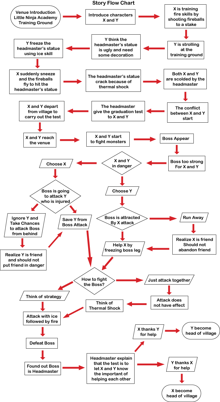
I have removed the evolution of boss character and also make the boss character actually is the headmaster with the aim to let the main characters realize the important of helping each other. I have create 2 different ending based on decision made by audiences when they choosing the main characters at previous part of the story. After I show my story flow chart to my lecturers, they have given me some useful feedbacks on how I can further improved my storyline. One of my lecturers also point out that the front part of my story is not necessary because the audience will still able to understand the story without the front part of the story. Instead, he suggest me to use Non-Linear narrative method such as characters's flash back to shorten the entire storyline because he worried that if the storyline is too long, I may not have enough time to focus on the interactive elements of my hypercomic. 

For the my website interface concept, I play to use the simplicity concept, so that the audience will focus on my contents and won't e distracted by complicated or fancy background design. I manage to found a website which show examples of good simplicity, or minimalistic web design: 19 Examples of Minimalistic Web Designs. According to the author, minimal website, when properly designed, can be simple yet effective. From the examples shown in this website, I briefly know how a minimalistic web design shall look like.

In this few days, I also started to create my website user interface from scratch, as I need to show the UI design to my lecturers on this week according to my Gantt Chart and Module Guide. My primary idea is to use scratchy background with ninjas' weapons such as kunai and shuriken as the design of my website. This is how my UI interface look like:


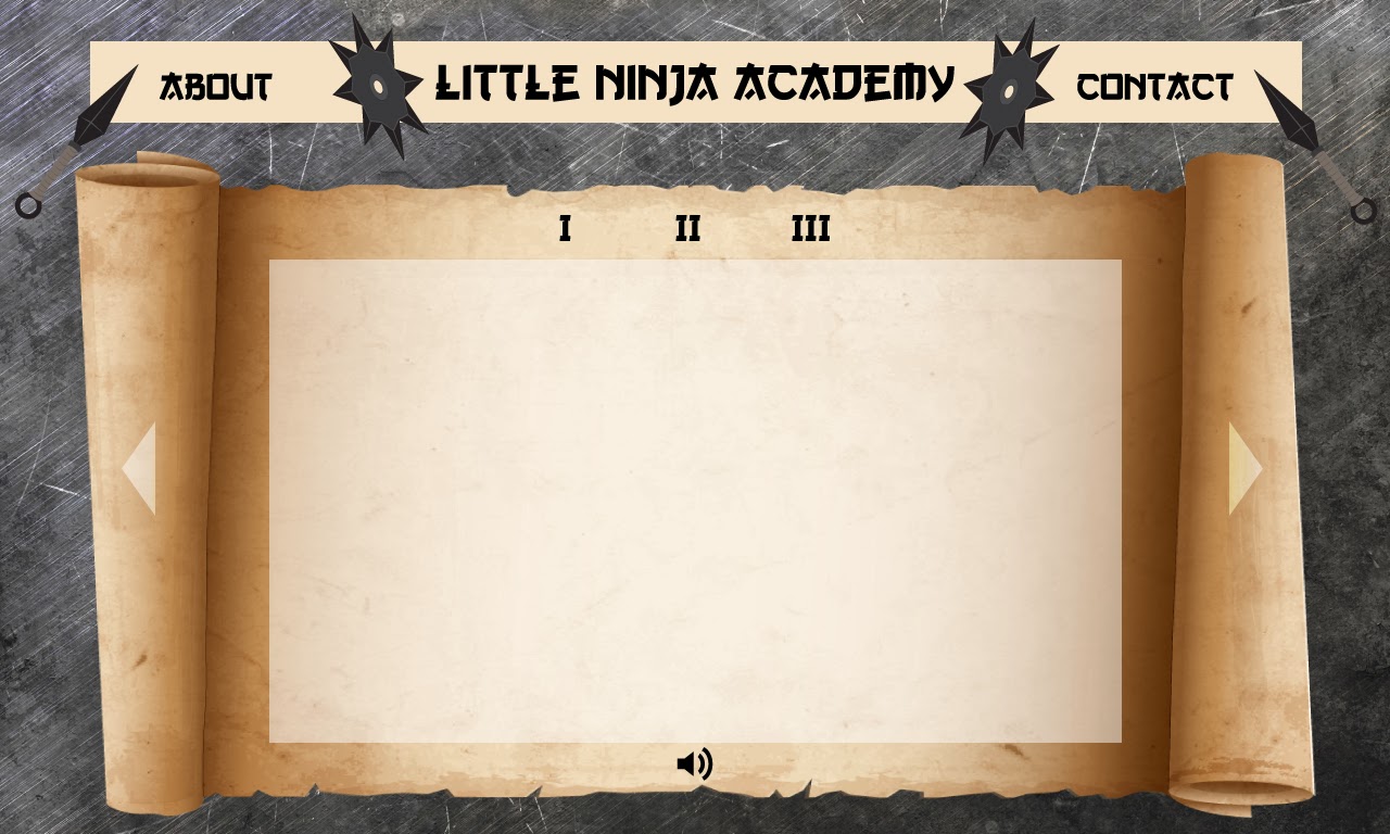
After showing my designs, I have received a lot of feedbacks from my lecturers. First of all, my overall design look too old school style, which is already outdated. From their advices, I know its time for me update my knowledge about current design trends so that I am not outdated if I want to survive in this industry. The next comment I received is the font used is not suitable for my project. At first I thought this kind of fonts can represent Asia trend, however after my lecturers explanation, I only know that Asia fonts do not look like this. The font I use is created by artist that have a misunderstanding about Asia tradition. At this part of conversation, my lecturers started to ask about my background and when they know that I do not have any Graphic Design background, they suggest me to look for some books and informations about graphic design and concept art to improve my drawing and design skills. I really appreciate them for introducing some of useful resources for me and I know that I need to further enhance my drawing and design skills in order to be a good interactive media designer.

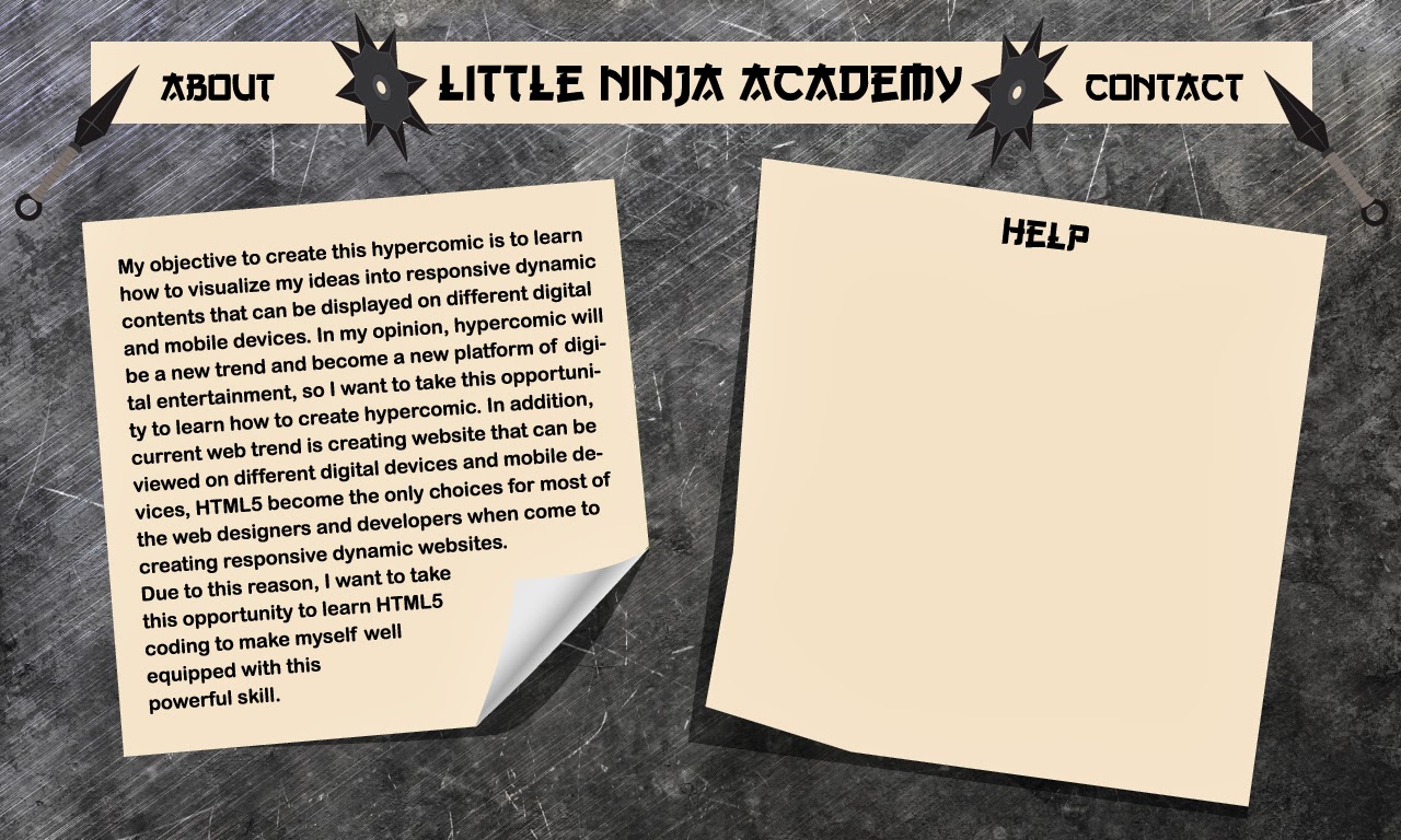
In addition, they also think that my about page contain too many words. They suggest me to use icons to simplified the words. One of the lecturers even suggest me to remove the about page and contact page as they are not necessary to be shown in this project. When I talk about I want to use simplicity concept to design my website, they ask for my references and when I show my references, they point out that my references are not relevant as most of them are not related to comic or anime. They suggest me to look for more relevant references such as "Naruto" and the references not necessary had to be in website, but also can be in books, cartoon or anime episodes and even games. Furthermore, some elements in my UI design such as volume button are not suitable to my subject matter, which is ninja. They suggest me to create my own sets on icons such as ninjas playing the drums as the volume button for my hypercomic.

This is a tough day for me as I suddenly realize that I still have a lot more things to learn. Before I end my discussion with my lecturers, I promise that I will try my best to show the revised UI design to them tomorrow.

Reference:
Muller, G. 2013. 19 Examples of Minimalistic Web Designs | Inspiration. [online] Available at: http://webdesignledger.com/inspiration/19-examples-of-minimalistic-web-designs [Accessed: 19 Nov 2013]. Annotation: This website basically provided me a lot of inspiration on how a minimalistic web design shall look like. I find quite a lot of examples here are impressive, however none of them suite my project, which is comic and anime genre of cartoonish design feeling.

Tuesday 3 December 2013

3 December 2013 Documentation

It's the start of a new month, and the fifth week for my hypercomic production. This few days, I have been working on my storyline, finally finished a rough storyboard to show to my lecturers and discuss with them in class today. Here are the storyboard sketches that I have done within this few days:


In order to produce this storyboard, I actually study some research on story telling methods. After done some researches, I manage to find a theory that is easy to understand and normally can apply to most of the artefacts that content narrative elements. The theory that I have found is Freytag's Pyramid Plot Structure which use 5 different dramatic arcs: Exposition, Rising Action, Climax, Falling Action and Conclusion to make a dramatic story.

Basically, my story is about 4 little ninjas that grew up together and showing their childhood friendship and also conflict at the beginning part, Exposition of the story. The Rising Action will be the day these 4 little ninjas recieved graduation test from the village head and carry out the test by wiping all the monsters on a particular mountain. The Climax of my story is when the boss appear and then evolved into stronger monster and cause the little ninjas fall into crisis situation. At this part is where the interaction elements of my hypercomic take place. The audiences are given different options and each decision they have made will lead to different outcome of the story. The Falling Action of my story is one of the little ninjas come back with the help of village head to save the other little ninjas. The Conclusion of the story is when the village head explain to the little ninjas that the purpose of the test is to let them realize the importance of friendship and teamwork on the same time learn from each other.

After discussed with my lecturers, they are satisfied with the interaction components of my hypercomic. However, they think that the storyline is too long, and worried that I am not able to finished in just few weeks more times. One of my lecturer actually suggest me to reduce the numbers of characters of my story so that I do not have to spend extra time on creating 4 main characters and on the same time can reduce the scale of my project. They also advised me to prepare the storyline earlier next time so that they can help me to scale the project earlier and let me have more time to develop the interactive elements of my project.

Reference:
Quickbase.intuit.com. 2012. An Online Resource Guide to Freytag's Pyramid | Intuit QuickBase. [online] Available at: http://quickbase.intuit.com/articles/an-online-resource-guide-to-freytags-pyramid [Accessed: 3 Dec 2013]. Annotation: This website teach me how to create a dramatic storyline using Freytag's Pyramid Plot Structure. It explain in very details that what should I do in 5 different dramatic arcs of the story.