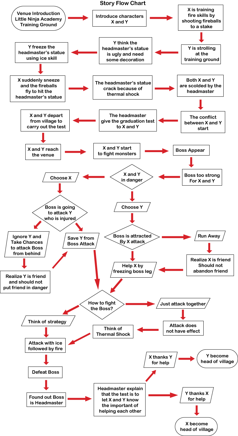
After considering my lecturers advises, I decided to reduce my main characters of my hypercomic to 2 person, which are the Fire Ninja and the Ice Ninja. I have done some amendment to my storyline and create a complete story flow chart as my guideline when illustrating the actual storyboard. Here are my completed story flow chart:
I have removed the evolution of boss character and also make the boss character actually is the headmaster with the aim to let the main characters realize the important of helping each other. I have create 2 different ending based on decision made by audiences when they choosing the main characters at previous part of the story. After I show my story flow chart to my lecturers, they have given me some useful feedbacks on how I can further improved my storyline. One of my lecturers also point out that the front part of my story is not necessary because the audience will still able to understand the story without the front part of the story. Instead, he suggest me to use Non-Linear narrative method such as characters's flash back to shorten the entire storyline because he worried that if the storyline is too long, I may not have enough time to focus on the interactive elements of my hypercomic.
For the my website interface concept, I play to use the simplicity concept, so that the audience will focus on my contents and won't e distracted by complicated or fancy background design. I manage to found a website which show examples of good simplicity, or minimalistic web design: 19 Examples of Minimalistic Web Designs. According to the author, minimal website, when properly designed, can be simple yet effective. From the examples shown in this website, I briefly know how a minimalistic web design shall look like.
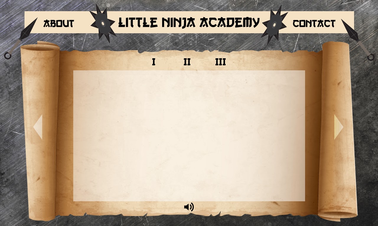
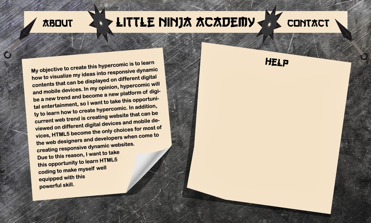
In this few days, I also started to create my website user interface from scratch, as I need to show the UI design to my lecturers on this week according to my Gantt Chart and Module Guide. My primary idea is to use scratchy background with ninjas' weapons such as kunai and shuriken as the design of my website. This is how my UI interface look like:
After showing my designs, I have received a lot of feedbacks from my lecturers. First of all, my overall design look too old school style, which is already outdated. From their advices, I know its time for me update my knowledge about current design trends so that I am not outdated if I want to survive in this industry. The next comment I received is the font used is not suitable for my project. At first I thought this kind of fonts can represent Asia trend, however after my lecturers explanation, I only know that Asia fonts do not look like this. The font I use is created by artist that have a misunderstanding about Asia tradition. At this part of conversation, my lecturers started to ask about my background and when they know that I do not have any Graphic Design background, they suggest me to look for some books and informations about graphic design and concept art to improve my drawing and design skills. I really appreciate them for introducing some of useful resources for me and I know that I need to further enhance my drawing and design skills in order to be a good interactive media designer.
In addition, they also think that my about page contain too many words. They suggest me to use icons to simplified the words. One of the lecturers even suggest me to remove the about page and contact page as they are not necessary to be shown in this project. When I talk about I want to use simplicity concept to design my website, they ask for my references and when I show my references, they point out that my references are not relevant as most of them are not related to comic or anime. They suggest me to look for more relevant references such as "Naruto" and the references not necessary had to be in website, but also can be in books, cartoon or anime episodes and even games. Furthermore, some elements in my UI design such as volume button are not suitable to my subject matter, which is ninja. They suggest me to create my own sets on icons such as ninjas playing the drums as the volume button for my hypercomic.
This is a tough day for me as I suddenly realize that I still have a lot more things to learn. Before I end my discussion with my lecturers, I promise that I will try my best to show the revised UI design to them tomorrow.
Reference:
Muller, G. 2013. 19 Examples of Minimalistic Web Designs | Inspiration. [online] Available at: http://webdesignledger.com/inspiration/19-examples-of-minimalistic-web-designs [Accessed: 19 Nov 2013]. Annotation: This website basically provided me a lot of inspiration on how a minimalistic web design shall look like. I find quite a lot of examples here are impressive, however none of them suite my project, which is comic and anime genre of cartoonish design feeling.


No comments:
Post a Comment